Horizontal Web
- By Jessica Lord
- 2013-01-24
- web dev, design

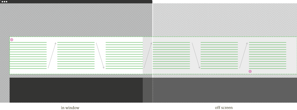
I recently re-did Mikeal Rogers website, Future Aloof. As the person who came up with the designs, I have only myself to blame for the crazy mess that is the horizontal reading website I’d envisioned. Let’s talk about it. Below is the structure of the important components for Future Aloof:

CSS Multi-Column, Video Bar
I needed the text to expand right in columns in a predetermined area of the page subject to change depending on if the video bar is toggled on and off. Video bar should be the width of the site and not end awkwardly in the middle. The path I took to making this work is what I discuss below, ignoring a lot of the overflow, white-space and other tribulations. The site also does a few other things like respond to your screen and at 1024px and under the video bar is eliminated and ‘video’ in the menu no longer toggles the bar but becomes a link to a video page. But those weren’t as finicky as these other bits.
Issue: Force Columns to Expand Right
Multi-column, and it seems the web in general, wants to expand down – not right. The only way I found to constrain the multi-column element #entries where I wanted it and force it to expand right was to wrap it in a container #entryWrapper with padding . There is a max-height option, which I may or may not have tried, it’s a haze, but in the end I chose to keep all constraining forces together in #entryWrapper.
On #entries I’m using column-width: 300px; so that it generates as many columns as it needs (rather than prescribing a number of columns with column-count: x;). Note, it uses this as a min-width suggestion and in my case generated columns that are 387px wide. I’m happy to say that the column-gap will remain true to you.
Issue: No Self Awareness
Now that we’ve got the columns constrained to where we want them on the page and they’re expanding right, we must solve the issue that it #entries has no idea how many columns it’s generated and how wide that’s made it or its parent #entryWrapper. This means other children like #videoWrapper won’t fill to match this unknown width.
So I set empty span “markers” at the start #theStart and end #theEnd of the text in #entries. I then used jquery to find the distance between the two, adjusting for negative numbers if the page has been scrolled right and the remaining column width to the right of #theEnd.
var start = Math.abs($('#theStart').offset().left)
var end = ($('#theEnd').offset().left) + 400
var pageWidth = start + end
I use this the give #videoWrapper a width on load and when the video bar is toggled on and off (because when the text has more or less vertical space, it takes up more or less horizontal space).
Also, forget having any control over things like particular columns or every other column or nth column…
Issue: Firefox
While Firefox supports the multi-column in general, it doesn’t seem to support column-break-before or column-break-after, which is a shame, because in webkit that’s how you can tell it to avoid breaking in the middle of lists or block quotes and to always break for new posts.
Those damn scrollbars. In webkit I can hide the scrollbar ::-webkit-scrollbar {height: 0px; width: 0px;} and keep things looking the way I want while still having scrolling available through trackpad, mice, arrow keys or on-screen arrow clicks. Since the scrolling element is behind the right and left column navigation elements, in Firefox the scrollbar was awkwardly cut off on each end and made the center portion of the page however many pixels taller than the two right and left elements. Not wanting to use major plugins for dealing with scroll bars I sacrificed some of the single-frame experience of the page and used jquery to check for Firefox and then change the CSS structure so that the entire page scrolled and a more tolerable-full-screen-width scrollbar is used.
Tell Me There is a Better Way
Things seems fairly straightforward now, but it was quite a process. I did a lot of internet-researching, friend’s brains picking and general starting over and trying again before I came to these solutions. There doesn’t seem to be many horizontal reading-based (not just photography portfolios) websites out there – perhaps there is a reason. I’ll also mention that I was very much trying to keep the site as light and simple as I could. I didn’t want to bulk up on plugins or write mega js to parse text and generate columns. I like it being mostly CSS and 69 lines of jquery (half of which is unrelated to columns and scrolling right but handles toggling of the video bar and menu navigation) But, alas, there now exists one! A horizontal reading site! Push the web right!
But seriously, share experiences and insights, please.
Links
- Mikeal Rogers’ Future Aloof
- Multi-Column Layout on MDN
- Thinking for A Living, the only really good, not strictly photos, horizontal website I know of